hi there random person... wanna hear about a ton of random stuff i've been thinking about lately? one thing I've been thinking about artist... and not artist. and one thing i've discovered about artist is that they can see more in other peoples art than most people. as i've done more and more art i've most definitely noticed a change in the way i see things. my artistic eye as grown so much. it's gone from a scrawny little pipsqueak to a muscular fiendDANGTHISSTUPIDHEADAKE!!!!! ... and know what? there's something this muscular fiend would like to say! abstract art is cool. a lot of modern art is cool. there is a lot of it that's just pretty dum... but not all of it.
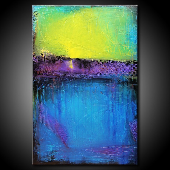
here's a piece i found on etsy that i really like. if the artist of this sees this post i really hope you don't mind me copying your art to my blog. so you could say it's boring. or that a three year old could have done it. or that something so simple couldn't be considered real art. after all there's only three colors and there's no complexity to the composition. but you probably didn't say those things... because your not stupid like that. first of all, complexity is over rated. there's a certain beauty in simplicity that so many people fail to see.

and second this is how it would look it a three year old had done it. of course the lines wouldn't have been so strait. but i think you get the point. like the fact that a three year old would not have known that by adding texture you give the eye something to look at and work on so it doesn't just get bored of it right away. actually a three year old wouldn't even know how and what to add. a three year old also wouldn't realize that by adding black around the purple and bottom half of the painting you make the the colors look more bright and intense without making them so intense that they fight with each other and set if all off balance. another way the artist kept that balance was by making the blue section the largest and by taking some of the blue and carrying it to the top around the yellow. doing that made blue the primary color of the painting. now the blue and the yellow don't have to fight for first place. there's also a little bit of purple in the blue... XP also the brightest part of the yellow is in the center and it fades out toward the edges. this give the painting a center point... something that draws you eye. without that there's no depth and your eye doesn't know what to do with it's self. in the three year old example i gave your eye it gets lost in a flat overstimulating plane of color. the the last thing i wanna say about it is that if you look closely there aren't really just three colors. the blue that's above is slightly more green and a little bit brighter than the blue bellow. and the blue bellow has like three different shades in it. you can see a darker blue dripping down from the purple and as it reaches the bottom it grays down a bit. and if you look closely there's even a bit of red in the purple here and there. so if you look from the piece above to the piece bellow you can see that there's a lot more emotion and depth and other good stuff like that in the one above.
i'll probably post on artist and not artist and stuff later. but i'm tired. so... until then... bye.
i like the random starnger thing XD thanks for the comment! that sketch took me about forty minutes. you're totally right -- artists have to have an aesthetic eye to be good at what they do. have a good night!
ReplyDelete